IoT Notifications Framework
Strategy for delivering omnichannel communication experiences, and encouraging cross-functional collaboration

Background
Our company develops software for Internet of Things (IoT) products in a regulated industry. When I joined, an agency handed off ambitious, exciting deliverables! It was time to execute. But from the beginning, there were problems swept under the rug, and cross-functional misalignment.
Client
My Role
Tools
Figma, Miro, Confluence
Confidential*
UX Designer (1 of 2)
*In cooperation with my terms of employment, client information is omitted. The material here is substituted or modified from the professional work it represents. Please reach out for details.
My Contribution
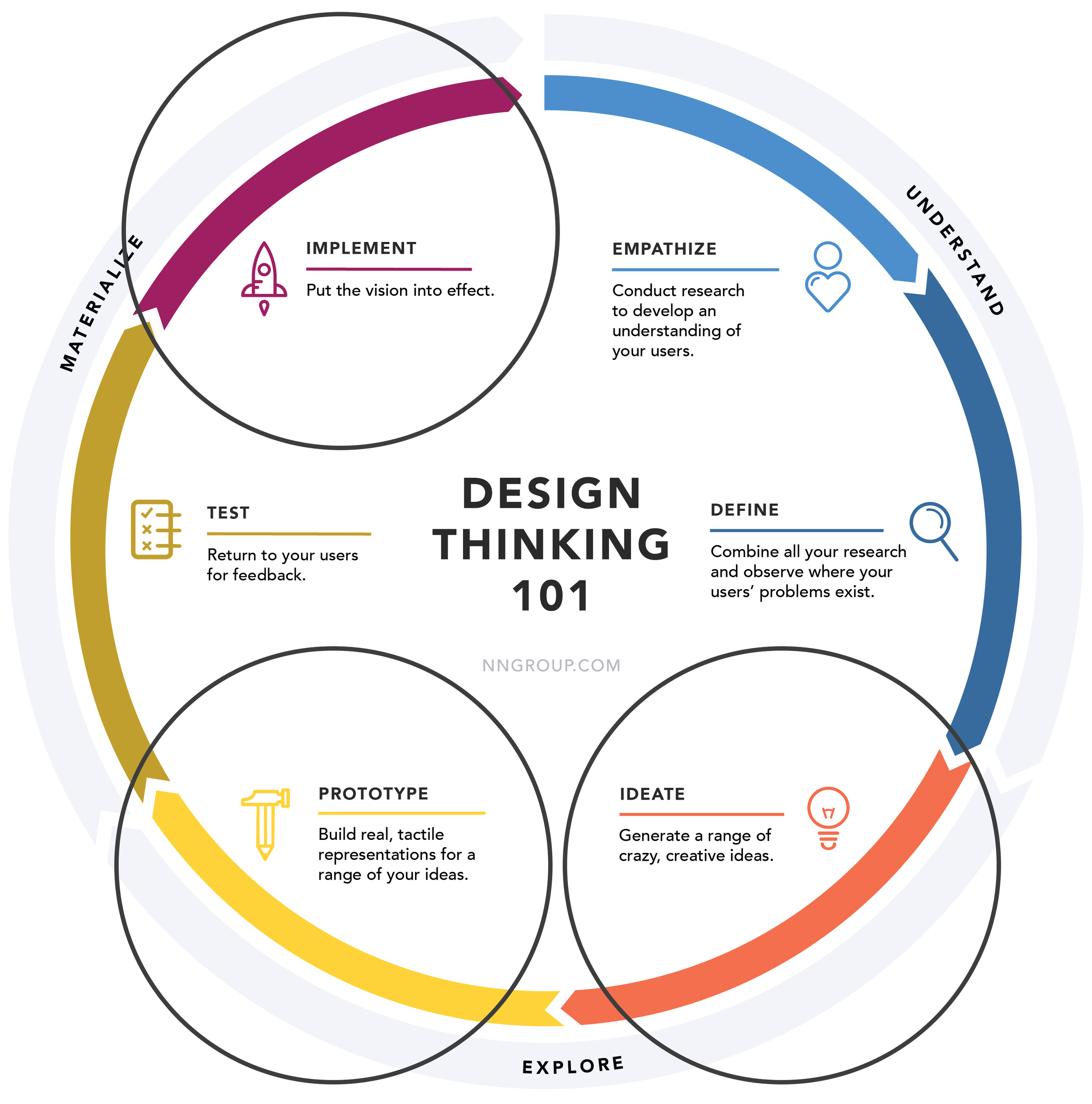
Design Thinking process, www.nngroup.com
I led the work displayed in this case study, while incorporating feedback from our design lead and cross-functional teams.
While my work is informed by research and usability testing, this case study is focused on cross-functional processes, visual design, and design refinement.
Component design, notification properties
Challenges + Constraints
Working in a regulated industry with unreleased products presented some unique, exciting opportunities. These factors were crucial to my design decisions.
-
To follow Verification and Validation guidelines set by the FDA, documentation should be clear and unambiguous. I collaborated with Firmware and Systems Engineering partners to reach a sufficient level of detail for our notification requirements.
-
As our Design + Human Factors team (3 total UX designers) was spread across the entire company, our capacity was limited. We were conservative in the responsibilities we committed to, and focused on higher impact, less reversible decisions. Writing copy for every notification, for instance, would not be a wise precedent to set.
-
As our products approached commercialization, we often pivoted and adapted to new learnings, especially changing content. Thus, scalability and flexibility (over a content-first approach) were key design principles.
I also had an impact by breaking the ice between Agile and Waterfall teams, as the Firmware and Software teams started collaborating on notifications.
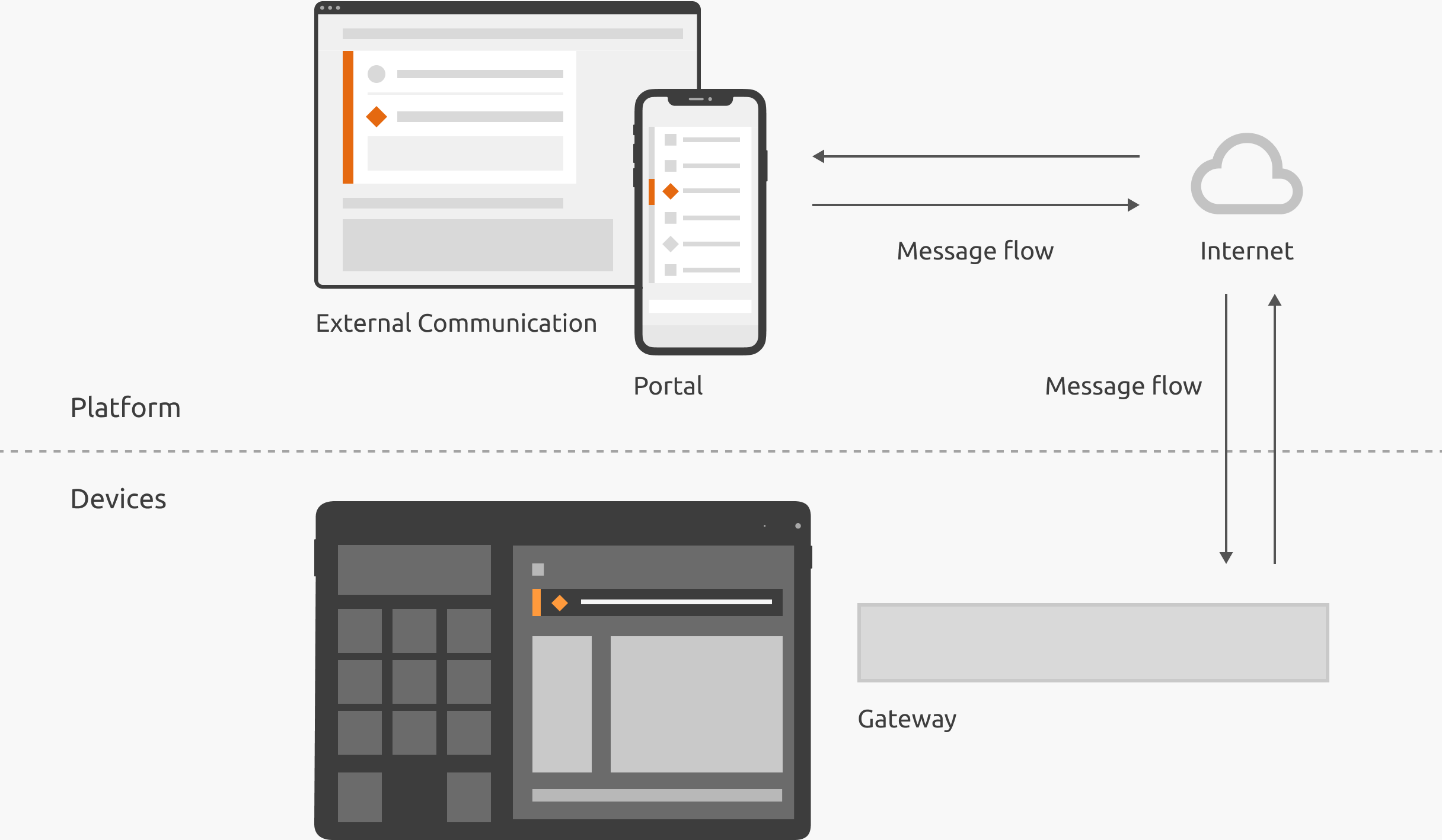
Infographic, IoT system model illustrating data flow for messages like notification events
The Problem
Our agency had created high-level, abstract concept designs (flowcharts, diagrams etc.) for notifications. These artifacts ideally illustrate how notifications work. However, based on stakeholder feedback and Sprint Review demos, the concepts lacked clarity, and bypassed Engineering’s input.
-
Notifications included systematic verbiage, unexpected interaction behaviors, and non-actionable information. These deviations from UX best practices were a sign of misalignment.
-
We frequently responded to questions like “What does this color mean again?,” and immediate solutions, like “users should see a dialog for that.” Tackling these individual interactions, while meaningful, was wasteful when repeated multiple times across several teams.
-
Initially we stood behind previous design decisions in order to preserve the holistic vision; however, this could have impacted our launch timelines. As a team player, I agreed to design refinements that would benefit both parties.
Simply put, it was clear that we needed to align on a vision to bring this concept to life.

Annotations, bugs captured in Production
The Solution
In order to consistently deliver actionable and meaningful communication experiences, we needed to clarify our design intent, refine our prototypes based on technical feasibility, and establish a manageable process for documenting use cases.

Clarify Concepts

I created artifacts centered around our most fundamental concepts, in order to streamline simple decisions and mitigate confusion. These deliverables, including verbal documentation, were published to Confluence for stakeholders, and kept in Miro for an active design version.
Despite our Design System guidelines, we often had lengthy conversations about which UI component to use for an individual use case. This Decision Tree helps bypass those redundant conversations, and expedite consistent decisions asynchronously, so that we spend our time on more impactful conversations.

Decision Tree – Defining UI component(s) for an event
Visualizing these concepts in the abstract (without high fidelity components), also shows how it can apply regardless of context. To design for a consistent and interusable ecosystem, in spite of products with specialized capabilities, I documented behavior and terminology as product-agnostic.

Annotations, product-agnostic notification anatomy

Annotations, product-agnostic behavior
Decision Tree, event to UI component
Refine Designs

Bypassing Engineering’s input led to impeded development progress. However elegant the design, it’s worthless if it can’t be built. Among other prototypes, I updated our Email Summary, considering it both an opportunity to improve the designs, and also design for technical feasibility.
Before


Mockup with annotations, summary email before
-
Engineering expressed concerns retrieving meaningful data on a daily basis. Moreover, overly frequent emails would desensitize users to notifications in general, and cause emotional friction.
-
Some of the data we designed for would not be available for the initial launch. Even if it were, the excessive information could inhibit decision making.
-
Some links had no logical URL to point to. They also didn’t provide information scent, or show users how that interaction is a step in the right direction.
After


Mockup with annotations, summary email after
-
Previously, we relied on users to interpret the information. I refocused our copy on a dynamic, meaningful conversation, aligned with our company’s writing guide.
-
As our products grow, and we adapt to new learnings, we will likely refine and add to this design. These simple rows are more scalable, and responsive for small form factor.
-
After reducing the email frequency to weekly, and removing excessive or unavailable data, the visual hierarchy was more manageable. I chunked and labeled content based on information type: status at the top, and summary at the bottom.
Documenting Use Cases

With our concepts and prototypes in order, we needed to document individual use cases. Under the hood, there’s an overwhelming level of detail to define, especially for Verification and Validation. At times, we got stuck in the weeds, and overlooked the underlying user need.
To reduce “soutioneering” and reground our conversations in a user-centered approach, I collaborated with stakeholders using a process I called “Events to be Communicated.” In the spirit of root cause analysis, I removed the word “notification,” and shifted the narrative.
“What will we show the users?”
“What is actually happening in the real world, and what might the users do about it?”

Miro board, process for asynchronously discussing “Events to be Communicated”
Once we aligned on the “Events to be Communicated,” I collaborated with stakeholders on applying the framework. For instance, we would determine the appropriate Component using the decision tree above. I also applied UX Writing best practices.

Excel spreadsheet, detailed documentation of each notification event, later managed by product owners
When deciding what and how to document, I considered a number of tradeoffs and compromises.
-
In order to manage our capacity as a growing design team, we left the ownership of notification copy to the Product Owners. Instead, our expertise was more valuable at the “pattern-level,” where decisions are less reversible.
-
In order to prevent an unwieldy documentation process, I considered including more variables in our spreadsheet, like “[Low, High] [Data Point] for [Device Name].” I used them to an extent, but never at the expense of matching the copy to the real-world event.
Video, user flow from Email Summary to product performance page
What I Learned
-
In regulated industries, there is a lot of sensitivity around requirements, verification, and validation. Our responsibility is to design the best user experience, even if it challenges the status quo.
-
Although we need to settle our vocabulary inflation, UX sometimes needs to walk stakeholders through a story without the lingo. The result is better alignment, and a healthier trust bank account.
-
As UX Designers, we take on a broad sweep of responsibilities. However, I learned that we shouldn’t set a precedent to “help out” beyond our capacity, especially if the work borders on another team’s responsibility.